Chosen Final Images and Why?
|
This photograph in itself is an inferred portrait, the face is not seen and therefore the identity is not seen. However, the focus of this project is that your hair can show your identity, rather than your face always showing it, and so therefore this image has a sense of identity even without the face. I'm really pleased with how it came out in terms of lighting and composition, however I would have preferred the models to wear a long sleeve black top so that skin wouldn't be seen at the bottom of each image.
I chose to submit this image as a final piece because it obvious embodies the focus of this project but it also shows a very specific hairstyle, very simply done, where the lighting is illuminating the extreme colour just enough for the viewers to realise that the hair is the soul focus of the image. When looking back at these images, I realise how much I have taken as inspiration from Trine Sondergaards work, how you see it within mine. |
|
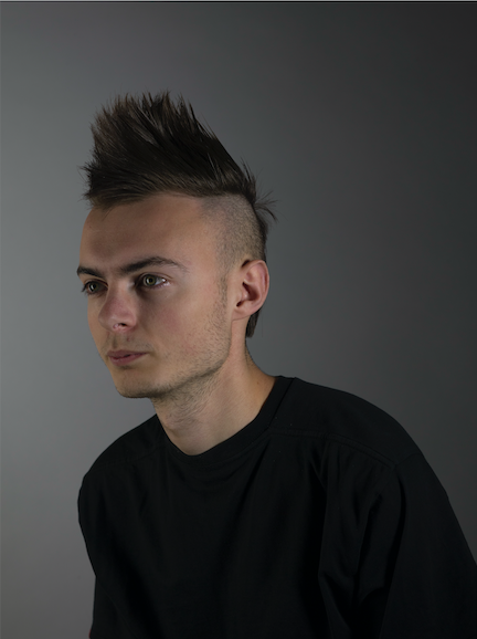
The angle of this image is why I chose it as a final submission image, it intrigues me to look at it. The extreme hair style is prominently seen in the image and the angle he is sat in gives his hair extra depth and shape, creating what once was a 2D image actually look textured. The lighting also aides with this, with the lighting falling on his face so that the shadows casted create shape to his face. Dan looks as though he were a graphics drawing rather than a person, which also interests me to look at, as the light falls on his eyes, gleaming so that they almost look shiny. The lighting and composition are exactly how I wanted them to be in this image and the fact that there is no arm skin at the bottom of this images makes me feel like it's my favourite out of this submission series.
|
|
|
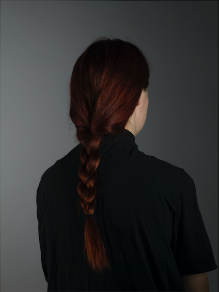
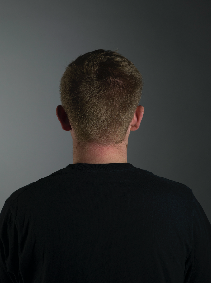
I have included this image into my final submission because I wanted a photograph of the back of someones head and felt as though I couldn't have the same person in two images. It's a very simple image in terms of composition which at the time I was intending to go for. However, now I look back on it I am not so keen alongside the rest of these images, because the composition seems too blunt and strict, whereas the rest have been side on from the front or back, with subtle changes in position, and this has too big of a position change alongside the others. I am still going to include it as a final piece because I feel as though I needed an image from the back, however for the next part of the project I will reshoot this image or similar to this to make sure the image itself does not look too posed and strict.
|
|
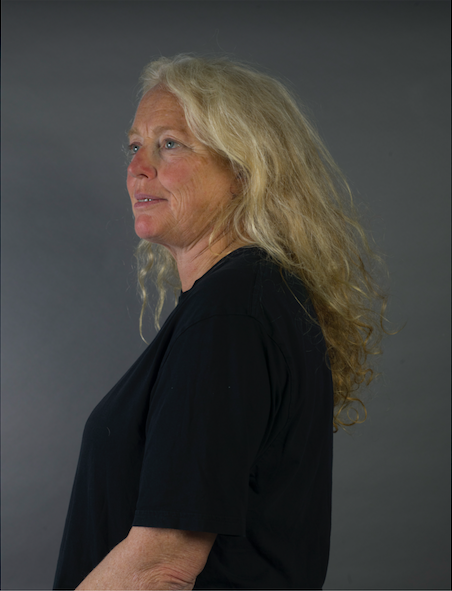
I am really pleased with this image, I feel as though it looks very regal. The hair falling so naturally and casually down her back gives this affect, with he gaze off into the distance. Most of the photographs I took of people side on meant completely in profile, whereas here I have asked the model to turn slightly towards the camera so each eye could be shown. I think I chose this image due to that positioning and how regal it looks. The hair also makes the image visually pleasing because it beautifully falls on the back and indicates that natural hair is also beautiful, that you can leave your hair as it normally sits and still have beautiful hair to shape your identity.
|
|
|
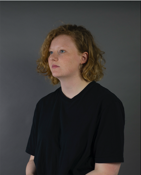
I positioned this image similar to the one above and one below, as it meant I could really show how the hair was the main focus of the image, and the only thing that changed was the hairstyle itself (and obviously the person). If I reshot this image I would make sure that skin wasn't showing at the bottom of the photograph but otherwise I'm very pleased with this photograph. Robbie specifically took her hair down to show me how it looks naturally, as well as how she usually wears it, and this allowed me to see how different peoples hair is naturally when they don't feel the need to construct it and accessorise.
|
|
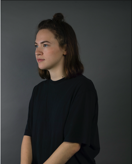
As you can see with the images above, they are all similar in composition and lighting and this obviously shows how the images actually embody my project idea, in the fact that I wanted to take portraits of each person using the same lighting, composition, clothing and strategy, making sure that they could all be visually seen together. I really like this image, especially the positioning of the face. The hair being styled on the top of the head indicates a construction having occurred, as the hair has not been left on the head but instead has been styled in a way to give edge to the individual and in turn give edge to the individuals identity.
|
|
|
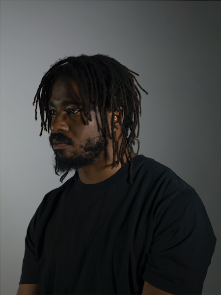
My final portrait is definitely one of my favourites. It's something to do with the strong gaze from the model, acting for the camera with a neutral facial expression. I really enjoyed taking these photographs, especially as I know Shawn has a specific connection and relationship to his hair and so I was lucky to shoot him as, as a model he was interested in the subject of how one wears their hair, as well as having his own individual hair to wear and show within the image. I'm also very pleased with how crisp and sharp the image is, and all the other images for that matter. I find focusing an image very hard, perhaps because I wear glasses, I'm not sure! However, for this project I wanted to create very high quality images and so I made sure that I could get the focus completely right, shooting and shooting until I did. And I feel that the images are much more successful and visually pleasing for the time spent actually taking them.
|
|
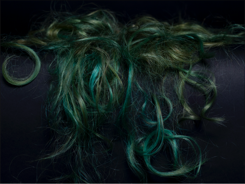
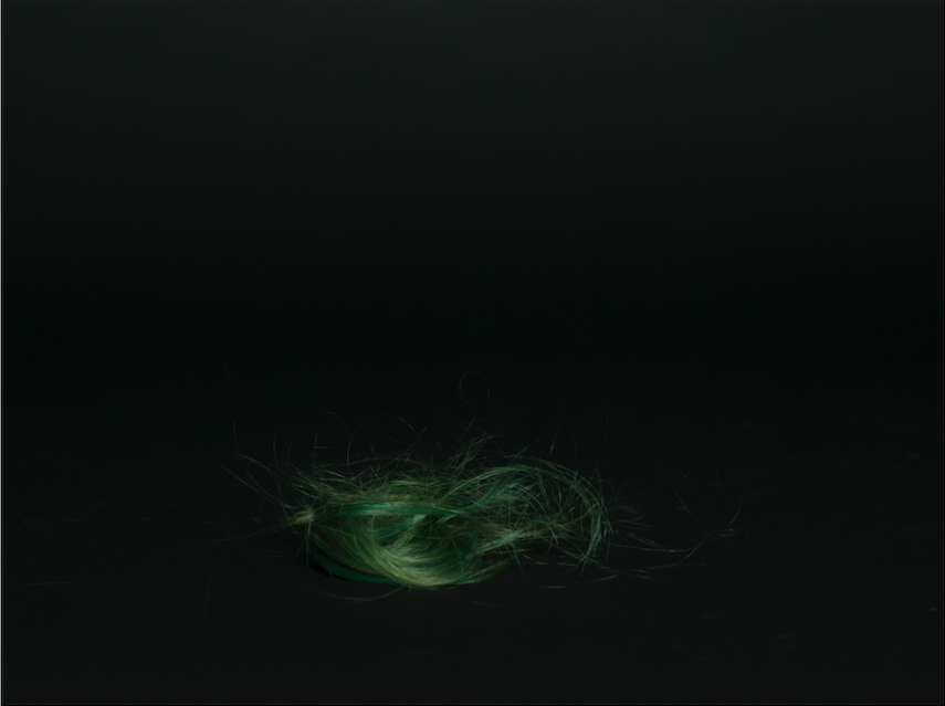
I chose this still life image because I believed the hair looked as though it was falling down the back of someone, as if it was actually being 'worn'. I'm really happy with the colour of hair I was able to collect too as the bright green colours show up so strongly against the black background, as if they were beautiful brush strokes of paint on a dark canvas. If I were to take this image again though I think I'd take a step backwards so I could get the whole of the hair in, with space around it to breathe, rather than having to crop it to the right shape and in turn crop out some of the hair.
|
|
|
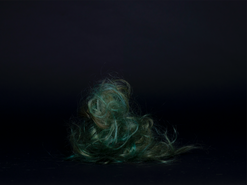
To me this image looks a little like a side profile of an octopus, with the bugling shape at the top and the feathering out of hair at the bottom. I chose this image as I feel it show both embodiment of the project, alongside studio skills. The background is as dark as it possibly could be, with the hair itself lit prominently in the image, not creating any casting shadows at all. This I feel makes the image look much more professional and of high quality as it has strong tonal contrasts within it, with the very dark background and sharp foreground and object.
|
|
This image is similarly lit to the one above which pleases me as they can been seen together in a visually pleasing manner. The images shows only one lock of hair and I like this because the other still life images are full of hair, the whole frame basically from top to bottom. I always forget about the need for negative space and within this image the extreme amount of negative space allows the hair to stand out prominently and the colour to be strong and bold, but not spread throughout the image so that the tones get messed about with. If I were making a book, I feel as though this image could be the cover image, maybe turned on its side with the title in the negative space, as a lock of hair sits their along with space around it for text.
|
|
